Tata Shop Share Smile
Migrated Tata ShopShare Smile’s web experience to Tata Neu by reimagining it as a seamless native app experience.
Role: Lead UX Designer (Team of 3 designers)
Project timeline: October 2023 - July 2024
Design Tool: Figma
01
Background
The Problem
Tata Shop Share Smile, launched in 2013, provides exclusive benefits to 1,028,000 Tata Group employees. However, a persistent concern is that it offers only a fragmented website experience.
My Contribution
Led the design for Tata Shop Share Smile proposing a research-driven solution that challenged initial business assumptions.
The Impact
The migration of Tata Shop Share Smile to the app led to a significant increase in user engagement, with 18-19K daily downloads and verifications. Around 6K users complete their journey daily, while 2-3K unique visitors engage with the platform daily.
02
Research
I initiated the project with a stakeholder workshop, bringing together business and product teams to dive deeper into their needs. The goal was to gather insights beyond what was outlined in the PRD, enabling me to define accurate problem statements to work with.

After the workshop with the product and business teams, I consolidated all the responses and identified four problem areas that emerged.

After the workshop, I conducted user research to identify pain points with the current website and assess users’ awareness of Tata Shop Share Smile as a program. Through interviews, I gathered insights into usability challenges, navigation difficulties, and content gaps that impacted the user experience. This research helped uncover key areas for improvement, guiding design decisions to enhance usability and increase program awareness.

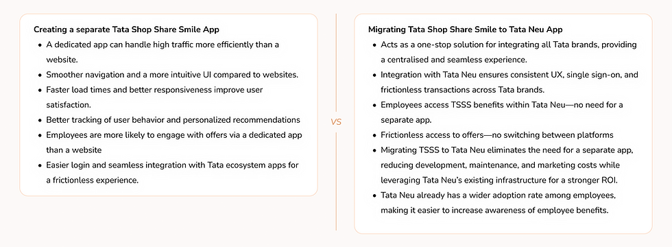
After the workshop and user interviews, I worked closely with the team to explore different approaches to the project. Through our discussions, it became clear that instead of redesigning the Tata Shop Share Smile website, the smarter move would be to migrate it to the Tata Neu app. To back this up, we did a quick comparison between building a standalone TSSS app and integrating it into Tata Neu. Once we had our insights in place, we took it to the business and product teams, had detailed discussions, and were able to get them on board with the migration plan.
03
Brainstorm
Now that I got the basics down, I jumped into the fun part—brainstorming! I set up a quick brainstorming session and invited some designers from our internal team, I used the Disney Creative Strategy, inspired by Walt Disney’s approach to projects, to guide our session.
I kicked things off by breaking down the three roles for brainstorming: "the dreamer," "the realist," and "the critic." We started with the dreamer, letting everyone throw out ideas with no limits or judgment. The main aim here was to get as many ideas as possible without stressing whether they were practical. Then, we switched to the realist, thinking logically and figuring out how to turn these ideas into action. Finally, we put on our critic hats to pick apart the ideas, looking for flaws or obstacles.
We wrapped up the brainstorming session with a quick 5-minute voting round. Each person got three votes to pick their top three ideas.
04
Final Designs
We concentrated on the most significant pain points and addressed them first in the project's initial phase.

01. Feature: Global Search
User's pain point
Design intervention
"The current process of searching for offers is too cumbersome. I can’t quickly find what I need, and using two separate dropdowns to search for an offer or brand is not scalable, especially on the mobile web."
Given that TSSS is a legacy platform, and users are familiar with the high-ticket brands and often look for those specifically. Adding the ability to search for an offer directly significantly speeds up the process for users.
Pain point we solved for
Offer discovery and navigation
02. Feature: Offer discovery widget
User's pain point
Design intervention
"The process of selecting categories and brands is overly complicated, with sub-brands not easily accessible and too many levels of filters. The dropdown functionality is ineffective, and the design is not intuitive. The category selection is confusing, leading to a random mix of different brands and offers, making it inconvenient to use."
We redesigned the entire offer section to make it more intuitive, providing users with a clear view of the various categories and brands that TSSS offers. The easy scroll through categories and brands allows users to interact with the brands they know and discover new ones.
Additionally, we added a category filter on the listing page, enabling users to change categories at any point in their journey. This reduces the number of clicks needed, streamlining the user experience and making navigation more efficient.
Pain point we solved for
Offer discovery and navigation

03. Feature: Offer details page
User's pain point
Design intervention
"The information is presented randomly, making it difficult to understand. For some brands, I am unsure of the next steps after availing the offer, and for others, I don't even know how to use the offer at all."
Each offer detail page is designed to prioritize content based on user needs. Contextual CTAs are added to ensure users can easily access necessary information. Additionally, post-journey completion messages are included to keep users well-informed throughout the process.
Pain point we solved for
Offer redemption experience
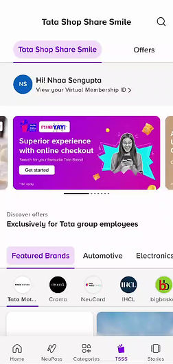
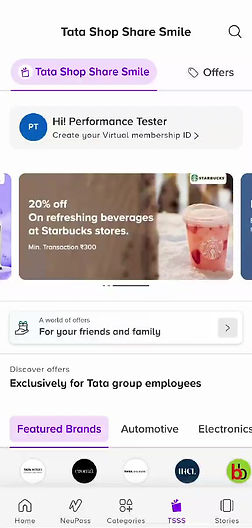
04. Feature: Virtual membership ID
User's pain point
Design intervention
"Whenever I shop at offline stores to use my employee discount, I have to carry my employee ID card, which can be a hassle because I sometimes forget it. I’ve also noticed inconsistencies in the offline experience: some stores require a physical ID, others ask for an email showing the offer, or they want me to retrieve the offer from the website, while some are fine with a digital copy of the employee ID. These variations confuse me, and I’d rather avoid the hassle altogether."
We created a digital employee card equivalent to the physical ID card. To enhance security, we implemented machine learning-based face recognition, allowing users to upload their profile picture, which will be uneditable. Additionally, details such as name and organization are also uneditable, except for the email ID, reducing the risk of unauthorized use.
Pain point we solved for
Offline store experience
05
Testing & Feedback
Before the SIT and CFT testing, we conducted a pre-SIT testing phase by creating a duplicate staging environment and giving access to 40 users within the Tata group to test the app. This allowed us to address any pressing experience issues and ensure that by the time SIT starts and more users have access to TSSS, we would have already resolved any blockers. It was also an excellent way to gather initial feedback on the designs and user experience. We sent out a user survey to collect responses and below are some of the responses from the users:
-
Sign-up journey: Most users reported a seamless journey and praised it as an excellent upgrade from the existing process. They found it easy to understand and quick to complete. However, one user mentioned difficulty accessing Tata Shop Share Smile, making it hard for them to sign up, and another user noted that the provided QR code wasn’t easily scannable for starting the sign-up process.
-
Top 3 features that were noticed: Most users noticed the wide range of brands that TSSS offers, as well as the search functionality and the prompt to create a virtual membership ID.
-
Offer discovery behavior: Most users discovered offers through the offer discovery section and the brand wall. Although the proposed design for the offer discovery received internal feedback that it wasn't very intuitive, the survey showed that users explored categories and offers through this component the most. Additionally, we replicated the brand wall from the website, and it was interesting to note that users navigated offers using the brand wall, a behavior retained from the legacy platform. Out of these three features, search was the least used.
-
Overall experience: Overall, the feedback from users shared was that the new experience was user-friendly and the designs felt refreshing
06
Learnings
-
This project was unique because I was involved from start to finish, actively shaping every decision. I worked closely with business, product, dev teams, and delivery managers, ensuring we were all on the same page. The biggest win? Bringing everyone together under a shared goal—building a great product. Aligning with different teams and seeing that collaboration clicked was a total game changer.
-
I teamed up with the content team to craft the app copy and worked closely with the branding team to shape the visual style for Tata Shop Share Smile widgets. This hands-on collaboration showed me how powerful cross-team collaboration is and helped me see the product from a more holistic perspective.